Composition and Dynamic Symmetry

Along the trail of learning in the art world we at some point have to accept the fact that composition is a crucial element to a complete painting process. This was a subject I put off learning for some time. I was probably like the new music student learning the notes to play an instrument who says to his instructor “Do I have to learn all of this? Can’t you just teach me to play a song?”. I just wanted to paint. Composition and color theory and all that stuff seemed like such a boor! But as musical notes give the musician freedom to play and create beautiful sounds so does composition add to the painter’s ability to successfully express on canvas with the bonus of engaging and leading the viewer.

Whether using a basic “L” or “S” shape or a bit more complex application, I am convinced that any path to follow is better than none at all. I can highly recommend a book by Ian Roberts, “Mastering Composition” for an in-depth introduction. I am a big fan of structure and processes and Ian does a fantastic job of cleanly laying out information in a way that allows you to memorize the concepts.

Of the many available tools to composing I have used one more than any other. A method that utilizes the golden mean called Dynamic Symmetry. The golden mean was used by the ancient Greeks in art and architecture and can be found everywhere in nature, even our own bodies. It is said to be the most appealing mathematical division of form and is calculated using a 1 to 1.618 ratio on any length of distance. For example a canvas of a 20″ width would have a golden mean vertically at 12.36″ (20/1.618). If the canvas was also 10″ high the horizontal golden mean would be 6.18″ (10/1.618). The “sweet spot” of a painting is said to be where these vertical and horizontal lines intersect one another.

As with many things the introduction of one concept or idea often leads to others. In this case the discovery of the golden mean lead me straight to Dynamic Symmetry. Using the same 1 to 1.618 ratio it also divides the canvas into multiple useful sections as shown in the below example.

Example of Dynamic Symmetry. To do this yourself first find the ratio of 1:1.618. Next I have color coded the lines to allow us to put them in the proper order. At the measured distance of 1:1.618 lay in the light blue line. Next the orange, yellow, green, blue and red. If done correctly your series of lines should look just like mine. (No, you don’t have to do them in color) The smallest rectangle is your “sweet spot” and the other lines can be used with your composition.

This method has been used successfully by many artists from Da Vinci to the father of wildlife painting Carl Rungius. I have done a layover to one of my paintings, “The Playground” to better demonstrate Dynamic Symmetry in action.

“The Playground” by Joe Kronenberg with Dynamic Symmetry layover.

Though I was unable to get a wolf’s head completely into the sweet spot, all four heads surround it. Notice also the eyes of the black wolf are on one of the lines. The diagonal line on the left separates the black wolf with the white wolf next to it. The wolf stepping on the rock is almost completely enclosed into one of the triangles with its leg on the right following the angle of one of the lines while the leg on the left lies directly at the golden mean line. Also notice how the black wolf is almost completely enclosed in the inverted triangle created by the diagonal and the line at its eye. And finally, I was able to structure the entire painting on the larger triangle created by the two angled lines. Triangles have been used as armatures for centuries having a fantastic visual appeal.

You can probably tell I have embraced and even gotten excited about compositions. Like that music student when he decided the real freedom lied in learning to read notes, I can now better express on canvas. There are those who argue this golden mean idea is nonsense and makes little difference where the viewer is concerned. I can’t say I agree, but the truth is, I don’t really know. What I do know is at the very least compositional tools give the artist structure. With structure comes peace of mind and confidence in your painting process.

Until next time…

Kronenberg Spotlight: Scott Waddell, a world class artist and instructor…

About this time last year I was actively researching workshops and instructors. Being a self taught/educated artist  this was somewhat new territory for me. As a wildlife artist I have been able to learn most of what I know and use on my own through books, the internet and close study and observation of paintings of other artists. So, why was I looking into workshops now?  I know that everyone is aware of the human form. Artist or otherwise we are all people experts to a degree. A child can tell if a painting of a person looks off, or not correct even if he/she has little artistic inclinations. Why? Because recognition of features is how we tell one another apart and that ability starts to develop before we can talk or walk. It is because of this I feel many artists are turned off or intimidated by painting people. It is also because of this paintings of people are more heavily scrutinized by the observer. So, in desiring to  accurately paint the human figure I was committed to learning to do it only from the best.

I’ll save the details of my twist of fate journey to get there for a future post, but as I researched and discovered classically trained artists to study with I narrowed it down to Scott Waddell. After viewing his “webisodes” on YouTube, visiting his website and blog I decided to book my flight to spend two weeks studying with him at the world famous Grand Central Academy of Art in New York City.

Originally from Florida, Scott received his BFA from Florida State University, then spent time studying with Douglas Flynt (another brilliant painter) before leaving Florida to enroll in the Florence Academy. He later returned to the states where he enrolled at Waterstreet Atelier (Now Grand Central Academy of Art) under the one of the best, Jacob Collins. After completing his education there, he was asked to stay on as one of GCA’s instructors where he continues to educate today.

Those two weeks with Scott have redirected my path in painting. I had never encountered anyone with his level of knowledge, coupled with the gift of great communication and instruction. From anatomy to the physics of light on form to color theory to drawing method to modeling form, there was not a single area he was not able to advance my knowledge. This coupled with his demeanor and clear desire to transfer the information in his head to his student’s made the entire experience unforgettable.

Portrait in progress by Scott Waddell

If you ever have the opportunity to study with Scott I highly recommend you jump at the chance. If, however that is not an option, the next best thing would be to view his webisodes on YouTube or better yet, visit his website www.waddellfinearts.com to download full-length videos on portrait, the figure and his newly released video on painting the still life, which includes forty minutes of bonus video with commentary. Subscribe to his blog while you’re at it to keep informed on future workshops and videos at scottssketchbook.blogspot.com.

“Steven” 11×14 by Scott Waddell

What is a Grisaille?

“Alecea Grisaille Study” 8×10 by Joe Kronenberg

It was not too long ago (about six years) that I decided I was going to make the transition from pastels to oils and I can remember being full of excitement about the idea, and of painting on huge canvases and having the smell of oil paints fill my studio. Though I had read up and studied a bit I soon came to the realization that I knew very little about the process of oil painting.

Being heavily inspired by the mood of the old masters and the vibrance and light of the Hudson River School of artist’s tonalism and luminism techniques I set out to learn as much about their methods as I could. Now, some years later I have developed and use four different classical methods either in whole or in part to get the result I am hoping for. Of the four the one I enjoy both using and teaching the most is an almost six-hundred year old method called “grisaille” (pronounced ‘griz-eye’), which is followed up by a series of glazes.

At about the end of the 19th century came the introduction of direct method painting, or impressionism, followed by post-impressionism then modernism. Right along-side these new methods were the critics of the day touting praises upon them while chastising the classical schools with their old rigid rules and methods of painting as being unenlightened and outdated. The result…less than a quarter century later the once world famous academies of art (Ateliers) were all but gone. Taking with them their centuries old techniques and methods of training.

The good news. Many of those methods were preserved at some level through writings and a very limited number of trained artists that could claim an unbroken chain back to the masters of old.

Four Steps of Grisaille:

1) Draw your image onto your canvas or painting surface with a pencil or charcoal. Once you are done with the drawing be sure to spray the surface with some workable fixative to prevent your drawing from coming off at step two.

2) I prefer either Paynes Gray (for cooler results) or Raw Umber (for warmer results) to tone the canvas with to a mid-range of value. This can be done by thinning down the color with some turpentine and brushing it on or by simply squeezing a small amount of the paint directly on the canvas and using a paper towel with a bit of turpentine on it to evenly spread the paint over the surface.

3) Once toned start painting in the darkest areas (values) of the image. The toned surface does much of the work acting as your mid-tone.

4) With the addition of white paint to your palette work into your mid-tones and light value ranges, modeling up to your lightest values on the form as you go, paying close attention to detail and creating the illusion of form. You should have the mindset that you are working towards a completed painting in monochrome.

Once complete, you can let it dry and it is ready to glaze in the colors (I’ll cover that process in a future post). Below are some examples of grisaille paintings before and after the final steps of glazing.

Until next time. Enjoy…

"Princesse de Broglie" by Jean-Auguste-Dominique Ingres

Any time you see a painting with amazing satin you can almost bet it was done with a grisaille base, then glazed as in “Princesse de Broglie” by Ingres. An interesting side note on this painting. As I was viewing it the the Metropolitan Museum of Art in NYC I noticed about an inch or so of unfinished painting at the bottom exposing the grisaille. Take a look at the detail below.

Detail of "Princesse de Broglie by Ingres

You can see about the bottom inch or so of this painting never got glazed. It is the brownish color just above the frame and it goes across the entire painting.

"September Strut" in grisaille by Joe Kronenberg

“September Strut” by Joe Kronenberg, in the grisaille stage. See the completed painting. I love how the detail of the grisaille can be maintained in the final painting.

"September Strut" by Joe Kronenberg

Completed painting, “September Strut” by Joe Kronenberg. Started in grisaille.

"Grande Odalisque" by Jean-Auguste-Dominique Ingres

This completed painting of “Grand Odalisque” by Ingres hangs in the Louvre. What a great before and after side-by-side!

"Grande Odalisque in Grisaille" by Jean-Auguste-Dominique Ingres
This grisaille of “Grand Odalisque” by Ingres hangs in the Metropolitan Museum of Art in NYC. It is said he painted it after the original as part of a student workshop.

Reference Photos I’ve Taken Recently in National Parks…

One of the coolest things us wildlife artists’ get to do is collect reference material. If you are serious about getting good reference, the zoo just won’t do. Besides being no fun at all in comparison, zoo animals tend to be over-weight and not as muscular. Many situations are funny, sometimes heart pounding (Like the time I got cornered by a bull moose in full rut. I obviously survived for those of you concerned 🙂 ). Observation of these animals in their natural environment is of great importance to the artist as well. Getting to know how they behave and interact with one another is invaluable when I’m back in the studio working on new concepts and ideas for paintings. I’ll be posting these and other images regularly on my blog and at my website at http://www.kronenbergart.net. Click “follow” if you haven’t already and you can be notified with each post.

Image

River Otter photographed in Yellowstone National Park. We hiked just a short distance above Mammoth to a small lake and found these two hamming it up for us. If you look closely, the one in front has a fish on the log. He kept bringing it up to show it off to us.

Image

One of my favorite spots in the country to capture images of bull moose in the Gros Ventre River in Teton National Park. If you get up early enough there is nothing like the first light of day bouncing off the antlers and shiny autumn coat of a big bull.

Image

This young Pronghorn was photographed in Yellowstone. The Pronghorn is the fastest land animal in North America. To see one of these things tear across an open plain is amazing.

Image

As we were photographing the River Otter above Mammoth, we heard some brush rustling behind us. So did the Otters. They made an exit to the other side of the lake. This Black Bear was looking for berries and we were surrounded by them. He didn’t stay long, but we got some great shots before he left.

Image

Just outside the west entrance of Yellowstone we spotted some Bighorn sheep through a scope close to the top of the mountainside. It was a looong tiring hike up but the reward was this beautiful light and setting.

Image

We had just finished a great morning of photographing Moose on the Gros Ventre River in Teton National Park. As we stood in a small circle sharing stories and preparing to move on we hear some chatter behind us in the river. This family of four River Otter put on a great show for about twenty minutes. Otter number four is out of the frame. No doubt the disobedient on of the bunch off on his own.

Image

I can’t take credit for spotting this one. My buddy and fellow artist Chad Poppleton and I where actually out looking for Elk when he yelled, “Buck! Stop!”. He has a great eye. It took me a bit to spot the antlers through the brush as this guy was bedded down. We moved in slowly towards him and as we got close enough to reach with the cameras made just enough noise to stir him up.

Image

Just like people aren’t they? She is ignoring him and he is strutting it trying to get noticed. These two were fun to photograph. The setting could not have been better. Great light, water and an active cow and bull moose. This scene almost paints itself!

Image

She came out of the brush and headed our direction so quickly, this poor guy had to abandon his equipment. Glad it wasn’t me. He later told me he was “just a bit stressed she might tip it over” as it was about $15,000 in camera gear! BTW myself and the others photographing were so concerned we couldn’t help taking tons of photos. lol.

Image

We can all relate. He just got up and was cranky. She didn’t want to move and started yelling at him. He does the mature thing and sticks his tongue out at her…

“…I can’t explain it.”

“I don’t know. I can’t explain it.” This was the answer given by me to my daughter when she asked why the Edvard Munch painting “Scream” was worth the $119,000,000.00 it had just sold for. After all most children (and adults) who see the image of this painting are less than awe-struck. A more apt description of the average person’s feelings would probably be “mildly disturbed”.

“Scream” by Edvard Munch

Okay, I get it. It’s telling a story. One of frustration and “losing it”. Something we can all relate to at some level. However, artistically does that create value in art? I can think of many similar quality works I’ve seen in my lifetime that are worth next to nothing, but evoke the same feelings or emotions as “Scream”. What do you feel when you view a Picasso or Pollock? I don’t know about you, but Me?…Yep, still disturbed. Yet I speak to those who have stood in front of the paintings of the old masters and claim to have experienced a host of emotions. Some even brought to tears. I know the first time I stood in front of a William Bouguereau my heart was pounding. I was speechless as I studied a small Meissonier for over an hour. The first Jules Bastien-Lepage painting I viewed still inspires me today as I look up the image of it often online. So…do emotions determine value? No. If it did, the three artists just named would surely have commanded millions for their work decades ago. It has only been in the last twenty years that any of their work has gained significant value. And that is nowhere near the value of the works of their contemporary modern artists.

Back to the original question then. What makes “Scream” and other modern artists’ works worth so much? Let’s look at another example. This last summer I was at the Metropolitan Museum of Art in New York City. After hours viewing the European art I decided to venture into the modern side of the museum and see for myself how I would feel after viewing them up close and in person. I saw textured paintings, splattered paintings, brilliant colors, muddy colors, welded metal sculptures, bronzes and more. As I went down to the lower level, I stopped in front of a large canvas by Ellsworth Kelly titled “Blue Panel”. I think more than any work of modern art I had viewed to that point in my life, this made me ask the profound question, “What the…?” A blue panel! Just blue! Minimal thought, no skill or training, only blue. Was I disturbed again? Yes. Only a bit differently. Now it was mingled with a tinge of anger. How could this work be worthy of this prestigious museum? This hanging here was the equivalent to me of standing in front of a grand piano, holding out my index finger and pressing a single key. Then being approached to repeat my performance to a sold out crowd at Carnegie Hall! A single note! That is all this painting is, yet it hangs with other works by Kelly in one of the most famous museums of art in the world.

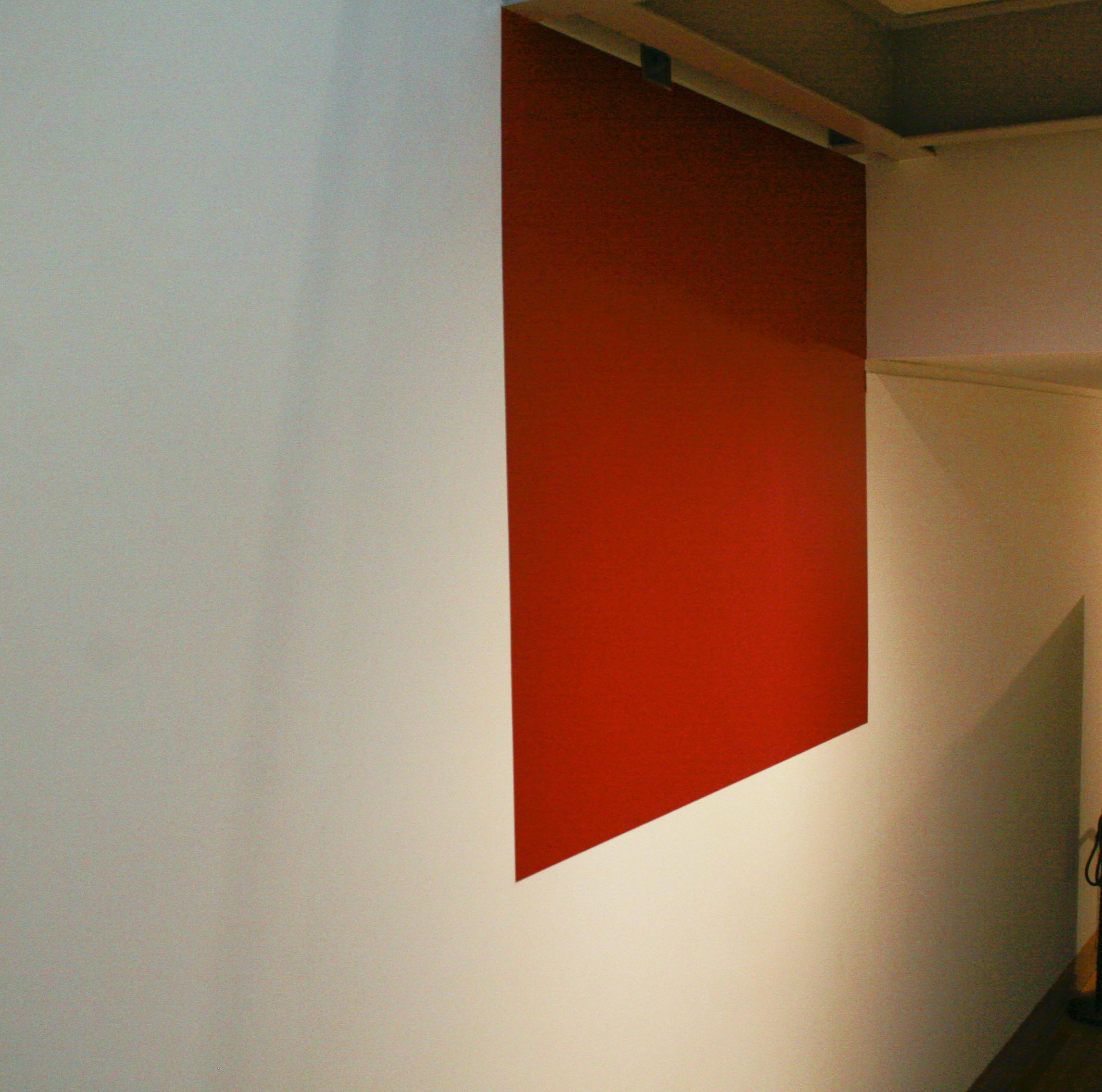
(“Reddish Brown Square on White Wall”
by Unknown Wall Painter Guy)    
“Blue Panel” by Ellsworth Kelly

After viewing the remaining works in the lower level, I started back to the upper floors. Then I noticed something. Not twenty feet from Kelly’s “Blue Panel” on the adjacent wall. Was it another Kelly, just in a different color? I moved closer to better examine it. Hmm. No name plate. And not corded off to prevent people from getting too close. I moved even closer. Then it hit me. Boy did I feel stupid! How could I have mistaken this for an Ellsworth Kelly? What was it? I’m guessing some wall painter’s idea of a joke. It was a reddish-brown square painted on the wall. Another masterpiece? Nope. Just a square. Painted by an unknown union painter I guess. Well, anyway, this unknown’s skills surely rivaled that of Kelly. He may have a carrier ahead of him. (Forgive the sarcasm. I’ll keep it to a minimum, but look at the two images and you tell me who had more talent.)

I have the answer! I had it all along. I know why someone paid $119,00,000.00 for “Scream”… Prestige suggestion. I only learned of this in recent years while listening to a key-note address given by Fred Ross, the founder of the Art Renewal Center, to  a group of artists at the national Oil Painters of America event in 2006.

Visualize this. You are with your spouse at an art gallery standing in front of a painting and you give a half chuckle and say to your better half, “Our three-year old could paint this.” You both laugh and shift your weight to move towards the next painting. Before you take a complete step you hear a voice say, “Excuse me? Um, excuse me. Did I just hear you say your three-year old could paint that?”

Not being one for public conflict you sheepishly reply, “Well, I, I, I guess I did. Yes”.

She responds, “Who are we to judge? I happen to love his work. He expresses himself through the canvas like no one I have ever known. You may look at this and say a child could reproduce it, but a child in no way could convey such a level of emotion as brilliantly as this artist does. I can feel the energy from here.”

You reply, “Ma’am. With all due respect. All this artist did was dump some green and red paint on the canvas, swirl it around a bit and drop some nuts and bolts into the wet paint. You don’t think my child could do that?”

“I’m only saying he is brilliant. As are many of the artists in here and you should not judge. His work is enlightened and fresh. So, before you condemn any more art or artists you should think twice about the emotion and feeling that went into creating these masterpieces.”

She turns to leave and you look at your spouse and mumble under your breath, “I don’t care what she say’s. A child could do that!”

Now. Fast forward six months, a year or whenever you are at another art show or event. This time you are with a friend from work. You approach him while he is looking at a work of crisscrossed colored lines covered by thick applications of paint that creates a texture over the flat linear lower layer. You ask, “So, what do you think?” He responds, “You call this art? I could reproduce this in my garage in ten minutes!”

Aware of the people surrounding you within ear shot, you reply “Well, I’ll bet it’s much more difficult than it looks. After all, we don’t know the story behind the painting. The emotion and feeling that went into creating it.” He reluctantly agrees and you move on to the next painting.

You have not only just been victimized by prestige suggestion, but passed it on to your friend! That women you met at the gallery months ago made you feel as though you were unenlightened because you did not “get”  that artist’s work. In order to not feel that way again you surrender what you know to be true with what you are supposed to “feel”. Now your friend from work will probably pass it on to others as well. I think most everyone has experienced this in one form or another. Whether from teachers, friends, spouses or strangers.

Please don’t think however that I am lumping all modern art and artists into this large pool of “unskilled work by untrained hands”. Much of modern art requires more than expression to create. Skill and training do come into play in many works. I am like many people I know I guess who look at the work of some artists and ask, “Why is this special?”.  Expression is supposed to evoke emotion isn’t it? First the artist, then the viewer of the art. Am I just bitter because I have spent years of study and training in the hopes of developing skill? Not really. It actually gives me piece of mind to know that very few people could duplicate what I do. My style and application of paint is uniquely mine. Much of modern art however can be closely reproduced with not much more than a materials list by just about anyone who wants to give it a go. Does that bother me? No. Let the modern artist create all they want and display it anywhere they choose. Just don’t suggest people are unenlightened or judgmental for having an opinion less than favorable about these kinds of works.

So. My daughter has been sat down and bored to death with my lengthy answer to her short question. Prestige suggestion has gone on for so long that we now see value in that which other than our perception has little. Nothing makes a painting like “Scream” worth millions but someones perception of it. On the other hand, this same technique has caused many nineteenth century academic artists to go from world fame and admiration to being written from our history books and viewed as irrelevant with their works removed from walls and put in basements or hidden away for decades. Don’t believe me? The three artists I mentioned above (Bouguereau, Meissonier and Lepage)  were household names in their day, just as we know Michelangelo or Rembrandt today. Today my spell-check doesn’t even recognize them (but it readily recognizes Pollock and Picasso).  These painters were not in my art history books. Were they in yours? I’ll save the other half of the effects of prestige suggestion for my next post…

Joe